
If all else fails, your color palette shouldn’t.
As an author, you know that your book cover is the first impression your reader will have of your work. It represents the story within, evokes emotions, and can help grab the attention of potential readers. One crucial aspect of your book cover design is your color palette. In this article, we’ll guide you through choosing the perfect colors for your book cover, highlighting color psychology, and showing you examples of successful palettes.
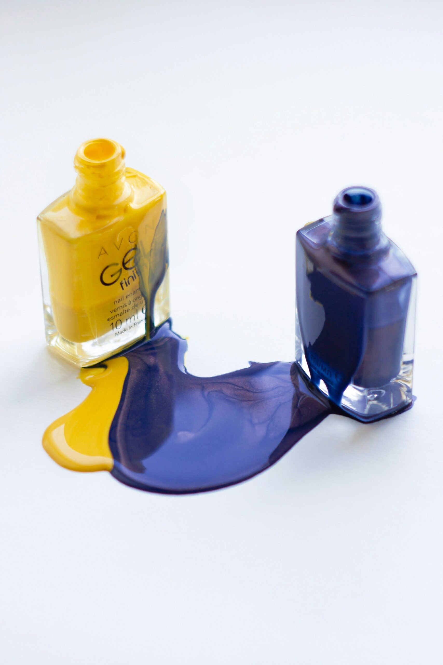
Choosing Your Colors
The first port of call is to research books written in your genre. You will notice a trend in the colors chosen.
Once you get an overall feel for what is generally done, you can begin compiling your color palette. If possible, stick to 2-3 primary colors, with 1-2 accent colors.
The colors selected should reflect the book’s mood, themes, and target audience. You can also use color combination strategies such as monochromatic, complementary, and analogous to achieve the right look.
The Psychology of Color
The Psychology Behind Color is a book all on its own, but let me squeeze it into a few sentences.
Colors evoke different emotions and set the tone for your book. Red is associated with excitement, blue with calmness, and yellow with happiness, just to name a few. You can also choose between warm and cool tones to further convey the mood of your book. It is essential to understand and use color psychology to your advantage when selecting colors.
Customizing for Ebook/Print
Keep in mind that colors may appear differently on screens than in print. Consider creating print-specific and ebook-specific palettes. To get the best results, utilize the recommended color formats and file types.
Testing Your Palette
Testing your design on various devices/platforms is critical to understanding how colors will appear to your readers. Feedback from your target audience can help you understand color moods and preferences.
Tweaking for Maximum Impact
Continuously adjusting your color palette until you get the perfect balance of hue, shade, and contrast can result in a legible and visually appealing cover.
Conclusion
Now, this is by no means comprehensive, and that is not the intention of these posts. We want to stimulate your brain and get you thinking about these various aspects. In most cases, you won’t be the one implementing any of this. You will hire people to do so, but understanding all of this will help you make informed decisions.
SO… Consider color psychology, test it on various platforms, and always aim to achieve the right balance to maximize your cover’s impact. Thanks for reading!


